Journal of Information Technology & Software Engineering
Open Access
ISSN: 2165- 7866
ISSN: 2165- 7866
Mini Review - (2021)Volume 11, Issue 1
Visualization of factory production flow facilitates test optimization decision-making, given the complexity inherent in many organization’s manufacturing environments. Constructing production flow visualizations can be difficult and time-consuming, and has often involved expensive simulation software. In this paper we describe successful work populating NIST CMSD Core Manufacturing Simulation Data from existing factory data, visualizing factory flows using the open source D3.js visualization toolset. By mapping existing factory test data using the CMSD standard, the open source visualization toolset represents a lower-cost mechanism for understanding and optimizing test operations, detailed in this paper. The visualization was developed with a small team and deployed into production at a large aerospace manufacturer over the course of four months, and is now used by multiple business units for factory flow optimizations of their complex engineered products.
CMSD; Core Manufacturing Simulation Data; D3.Js; Visualization; Test Optimization
Given the considerable cost reductions needed by our customers, we sought ways to reduce costs while increasing speed of product manufacturability. Our products, which range from radars to rockets, have lifetimes often measured in decades. There is significant engineering complexity and concomitant risk associated with product functionality, and as such, testing is extensive, contributing to both cost and schedule. “Seeing” that complexity is an important first step to understanding it, and is the focus of the bill-of- materials plus operations visualization in this paper, developed using the open source visualization tool D3.js (Data-Driven Documents) [1]. Employing this visualization in our factory operations has resulted in reduced costs through fewer tests and greater factory throughput. The visualization automated reduced to seconds what was a completely manual, months-long process that involved hundreds of hours of subject matter expert time for every product.
NIST has led the development of the CMSD Core Manufacturing Simulation Data standard over the past decade which is currently in use across a range of industries with many published case studies [2-5]. APIs have been written to translate between CMSD and simulation software environments, including QUEST, Arena, ProModel, and FlexSim [6]. The motivation for the work described in the paper comes from Rodic Jain et al., and Lechavelier et al., and Jain et al., who have suggested there is considerable value in approaches that can automatically populate the CMSD information model from existing factory data [7-9]. Kirchof describes an effort where flow shop simulation models were generated from SAP data [10]. Others have piloted specific examples of CMSD usage and suggested extensions [11-13].
We focused initially on reducing test cost, using a hypothesis that testing could be optimized by identifying redundant tests, and determining based on historical failure rates and rework costs whether a business case existed for optimization. From the existing SAP and testing data, it was difficult to ascertain programmatically where redundancy existed, so we engaged experts from the business, from engineering, systems test, operations, and quality. We discovered that manual processes were in place to construct views of factory flows that used bill-ofmaterials as a basis, and added testing and throughput information. We worked with several programs and manually built these same views to make sure we understood what was necessary to automate a visualization, to incorporate the characteristics to enable experts to quickly identify redundant operations. We implemented a direct linkage from our factory information systems to a bill-of-materials plus operations view of the data described in extending our work in test cost analytics in complex manufacturing environments [14-16]. The bill-ofmaterials plus operations visualization is described in detail in the sections that follow. The value of the current work is demonstrating how automatically populating the CMSD information model with existing factory data can facilitate test optimization decision-making, for instance, how redundant test operations can be quickly considered for removal with historical data using the approach by Deming [17].
The Core Manufacturing Simulation Data (CMSD) standard was designed to facilitate interoperability between simulation systems and other manufacturing applications [3]. The CMSD information model is a standard representation for core manufacturing simulation data, and by extension is a representation for as-built manufacturing data, which is how it is used in our visualization (effectively, the MBOM, manufacturing bill-of-materials). The “neutral structures” designed for efficient exchange of manufacturing data in a simulation environment are used effectively as data structures to visualize the as-built environment. Data originates in an SAP system, and is transformed to the target CMSD structures, accomplishing one of the design purposes of CMSD, the testing and evaluation of manufacturing software. The elements of the CMSD standard and their relationships are depicted in the top two rows of Figure 1, “The base CMSD model.” Bill-of-materials, parts, processes (plans and specific operations), and resources are included. This team developed extensions to the model that are specific to the visualization of the combination of bill-ofmaterials and operations, captured in “CMSD Extensions for Production Flow Visualization” (Figure1).
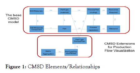
Figure 1: CMSD Elements/Relationships
The CMSD data model represents the relationship between the MBOM and sequence of operations that are performed to build out the individual components that form the final assembly. The sequences of operations for components are represented as Process Plan. We extended the CMSD data model to capture the component and operation level metrics to help users visually understand the quantity, quality, and amount of time required to manufacture a product. Some of the metrics are Production quantity; Rework quantity, Average hours, and Operation level metrics like First pass yield and Hardware driven yield, and are described further below. After transforming the SAP MES (Manufacturing Execution System) data into CMSD format in relational tables, we load the data on the client as JSON.
For any product, database tables are queried at run-time and produce JSON that is consumed by D3.js to produce Figure 2 below, fully navigable, zoomable, and pannable. We call this production flow visualization, while Jai et al described it as the bill-of-materials plus operations [14]. Zooming is accomplished with either the plus/minus buttons or with the scroll wheel on a mouse. This ease-of-use facilitates a balance between the inherent complexity of many of our engineered products, “seeing” the big picture, and being able to drill into a level of detail based on experience and intuition. Our initial goals included enabling experts to quickly identify potentially redundant operations. Interestingly, this often required experts coordinating across elements of the product who may not have coordinated before, so this visualization became important common ground for optimization efforts (Figure 2).
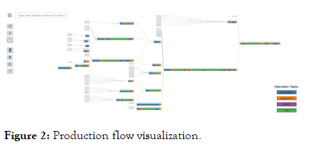
Figure 2: Production flow visualization.
The layout has parts that are coming into a factory on the lefthand side, rolling up into subassemblies and assemblies, and leaving the factory as a single part on the right-hand side. A design decision was made to only visualize serialized parts. Each grey box represents a single part (type). Where operations are performed on that part inside our factory, they are depicted as colored boxes, blue=Assembly, orange=Inspection, green=Test, purple=other. This simple set of operation types has been surprisingly useful in enabling experts to quickly determine potentially redundant operations, in particular, inspections and tests. To reiterate from the “Background” section, the SAP and testing data did not lend itself to automatically identifying potential redundant operations, so we constructed this visualization to quickly garner expert input. Figure 2 is a production flow visualization with six levels of indenture that we use throughout this paper to illustrate capabilities.
Our critical path algorithm uses average elapsed calendar time for an operation, the average time between when a part was first signed into an operation and when it completed (passed) the operation, so the path highlighted below in Figure 3 is the path with the maximum average elapsed calendar time. Braglia et al., used an analogous approach, visualizing the top-most critical path time based on when an order was created and ultimately shipped [18]. Either algorithm could be used with this visualization (Figure 3).
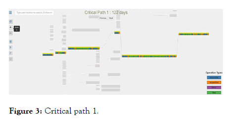
Figure 3: Critical path 1.
By clicking the “Next” button, the critical path with the second longest average calendar time is displayed as in Figure 4, a capability that Braglia et al. [17] also describe (Figure 4).
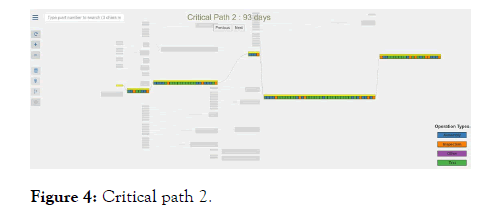
Figure 4: Critical path 2.
Natively, D3.js provides powerful visualization capabilities, an example of which is provided in the sequence of Figures 5-7 below, where the same production flow visualization is used. When the light bulb icon is clicked, a subset of operations matching specific criteria are marked with black borders as in Figure 5. Because all the data has been loaded for this product onto the client as JSON, it can be quickly evaluated using D3.js. The highlighted operations are those where a difference between two of the values for the operation is greater than 10%. The value itself can be manipulated at run-time, so for instance, only those operations where a difference of 25% could be highlighted. The value is in users being able to grapple with considerable complexity and quickly focus on those things that are most important. Here, the highlighted operations suggested cases where the test stations themselves may be contributing errors, versus the underlying product, so it becomes valuable to have experts look at this and make determinations (Figures 5 and 6).
Figure 5 shows highlighting before any zooming has occurred, while Figure 6 below shows further zooming into the boxed red portion of Figure 5.
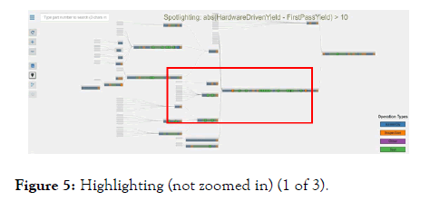
Figure 5: Highlighting (not zoomed in) (1 of 3).
Figure 6: Highlighting (zoomed in once) (2 of 3).
Figure 7: Highlighting (zoomed in) (3 of 3).
Figure 7 below is the zoomed in look at the boxed red portion of Figure 6. The visualization enables users to zoom in to any part or subassembly, and see the set of operations that are performed on that part. Every grey box on the visualization represents a part, and by clicking on it, the “Part Properties” are displayed. Part properties include part name, number, average days to produce, rolling throughput test yield, production quantity sold, rework quantity sold, return count, part cost, indenture level, and component quantity. Users may also click on any of the colored boxes which represent operations, although simply hovering above the operation with the cursor will display operation properties, including operation number (name), description, first pass test yield, hardware-driven yield, average labor, and earned standard hours (Figure 7) .
We have made several major changes to the original architecture as we have moved from on-premise to the cloud, what we call a lift-and-shift of the application. First, we updated how the application fetches the data from the underlying data source.
Previously, our application fetched the data from a traditional RDBMS data source, and for our cloud implementation, we moved the data to an internal Amazon cloud instance and exposed the data in JSON based Web Services APIs. With Web Services APIs, our cloud application fetches data through the Web Services API Gateway. The second major change involved a switch to Web Services APIs which removed all of the original dependencies on the Spring Framework. By removing all Spring Framework related dependencies from the code base, we were able to reduce many complexities in the final version of the cloud application, while maintaining the performance of the original.
This paper describes a bill-of-materials plus operations visualization for as-built product configurations implemented using NIST’s Core Manufacturing Simulation Data standard and the open source D3.js toolset. The production flow visualization has facilitated optimization of both test and inspection operations across a wide range of complex engineered products, by making it easy for experts to identify redundant test and inspection operation candidates. Extending the work of Deming, factory operations have been optimized, using production flow visualization as a starting point.
Citation: Bhat P, Berryman S, Burkhardt A, Cho M., Neumann S, Gharbiah H, et al. (2020) Manufacturing Bill-of-Materials Plus Operations Visualization Using D3. J Inform Tech Softw Eng. 11:247
Received: 05-Nov-2020 Accepted: 19-Nov-2020 Published: 26-Dec-2020 , DOI: 10.35248/2165-7866.21.11.247
Copyright: © 2020 Bhat P, et al. This is an open-access article distributed under the terms of the Creative Commons Attribution License, which permits unrestricted use, distribution, and reproduction in any medium, provided the original author and source are credited.